From CND to Hollywood: the ruthlessly brilliant designs of Ken Garland
Posted: 10th September 2020
The graphic designer who decried consumerism with a call-to-arms manifesto has won a lifetime achievement award. He talks about his career highs – and why so much modern design is ‘utterly mindless’

Mon 7 Sep 2020 12.48 BSTLast modified on Mon 7 Sep 2020 16.33 BS
In November 1963, dressed in an afghan sheepskin waistcoat and exuding his characteristic theatrical verve, Ken Garland stormed to the front of a meeting of the Society of Industrial Artists with a fiery message for his colleagues. He was sick of graphic designers wasting their talents on selling cat food, toothpaste, cigarettes and slimming powder. This visual incontinence had reached “a saturation point” he declared, adding that “the high-pitched scream of consumer selling is no more than sheer noise”. Designers, he implored, had a duty to devote their energies to more worthwhile ends.
His impromptu speech was met with rapturous applause and later published as the First Things First manifesto, a call to arms that would cement Garland as the moral conscience of graphic design for decades to come. “We are proposing a reversal of priorities,” stated the manifesto, which had 22 signatories. “We hope that our society will tire of gimmick merchants, status salesmen and hidden persuaders.” The few short paragraphs, published in the Guardian at the time, took on a life of their own, becoming a touchstone for successive generations of designers.
More than 50 years on, how does Garland feel about it now? “I did become rather bored with it,” says the 91-year-old from his home in London’s Camden Town, where he has always had his studio, a room piled high with printed matter, its walls covered with his colourful creations. “I’d had enough after 10 years but it went on and on, being revived and rewritten. I was never against advertising. But I did think that some of the stuff designers were recruited to promote was complete nonsense.”
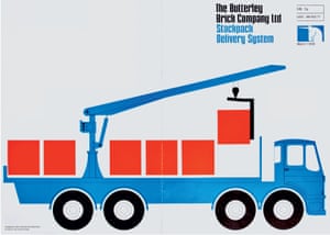
Next week, at a virtual ceremony, Garland will be awarded the lifetime achievement medal from the London design festival in recognition of his impact and influence over the years, tirelessly teaching, writing, speaking, photographing and creating some of the most powerful and playful designs of the era. His clients have ranged from Galt Toys to CND, along with movie giant Paramount Pictures, Which? magazine and the Labour party, each brief met with ruthless clarity.
Not that his style is always easy to spot. “Rudimentary yet elegant” is how Adrian Shaughnessy defined Garland’s unadorned, no-nonsense approach, in his 2012 study of the prolific designer. Heavily inspired by visits to Switzerland, Garland combined Swiss typographic rigour with a freer sensibility learned from such American designers as Saul Bass. Garland’s work was always “direct, emphatic and as lean as a whippet”, wrote Shaughnessy. “Content was foregrounded and superfluous decoration eliminated.”
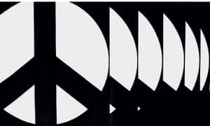
It is an attitude encapsulated in his designs for CND, for which he redrew the famous peace symbol into the clean-lined graphic familiar around the world today. The circular emblem was originall">y created by textile designer His famous black and white poster for the 1962 Aldermaston march placed repeats of his design in a procession, one in front of another. The result is a striking illusion, with the placards seemingly marching towards you.
“I still think protests are the place designers should be looking,” says Garland, who is a member of CND to this day. In 2011, he could be found wandering the Occupy camp outside St Paul’s Cathedral, striking up animated discussions with protesters about their signs. “Non-designers can be very, very inventive. A lot of it is much more interesting than what we professionals are doing.”
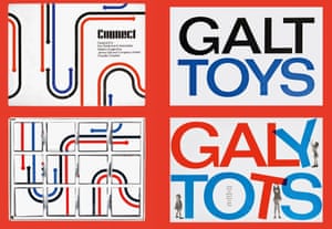
Born in Southampton in 1929, Garland grew up in the market town of Barnstaple, north Devon, next door to a farm, which he loved exploring as a child. If he hadn’t gone into art, he once recalled, he would probably have become a farmer. When he was an established designer, creating stark campaigning messages for disarmament, Garland was also at work on one of his most playful and enduring commissions, reinventing James Galt and Company as Galt Toys, a client he would keep for 20 years. “I was determined that it wouldn’t be one of those dreary logos that stays the same for ever,” he says. “So we designed it to be mucked about with.”
Selecting a clean sans-serif typeface, he set about designing an identity in which the letters could be jumbled, overlaid and messed around with, as if toys themselves. On one catalogue cover, a child pulls down a T, while another props up a Y, rearranging the logo to form the words “Galy Tots”. He and his associates found themselves designing some of the actual toys, too, including one of the most successful lines, Connect, which is still in production today (now sold as Rivers, Roads & Rails, with decidedly fussier graphics).
Garland’s unprecious treatment would become a theme throughout his career. In his eyes, brands are there to be adapted and manipulated according to context and purpose – and, above all, to keep things fresh and interesting. “I think so many corporate identities become a straitjacket,” he says. “Designers draw up vast manuals with rules stating exactly what size everything should be. They believe it should be all-consuming, but I find it utterly mindless. I think it’s horrifically unimaginative that we should still be living with the same Coca-Cola logo. My God, it’s a bore now.”
Instead, he says, an identity should be a “starter” for successive designers to evolve. And they should know when to say no. “You’ve got to realise that the role of a graphic designer as a consultant is to be able to say to a client, ‘I think we’ve had a bit too much graphic design. Let’s lay off a bit and let things rest.’ Things should be able to proceed at their own pace.”
If Garland seems good at dishing out wisdom, he has had a fair amount of practice. He has taught almost continuously since he graduated from London’s Central School of Arts and Crafts (now Central St Martins) in 1954 and has been a regular feature of the lecture circuit, giving energetic performances, always wearing one of his trademark embroidered hats. He once fired a starting pistol in the middle of a lecture. He has also dropped his trousers and smashed a mobile phone – all to prove the point that the designer’s role is chiefly to grab your attention.
“He has a disarming ability to surprise,” Shaughnessy tells me. “I remember a panel discussion at which designer after designer simply moaned about their clients. At the end, Ken said some of the best experiences of his life had been with his clients. Indeed, some of them had become his closest friends.”
Chatting to the charismatic Garland, it’s not hard to see why. “I’ve been incredibly lucky,” he says. “I’ve never had to go and hunt for clients. They somehow have come to me.” Luck had little to do with it, though. It seems to have been more due to his willingness to listen. As graphic designer Richard Hollis puts it: “He would engage with the client and make sure the design was appropriate for that client, and wasn’t a sort of reflection of his own style. He was interested in communication more than creating a beautiful image.”
Garland is keen to stress that his firm has always been Ken Garland and Associates, of whom he has never had more than two or three, working at his home studio, and that all the work has been a team effort. His colleagues held the fort while he was busy teaching, writing and photographing, that last passion leading to a series of exhibitions and self-published books, featuring closely observed studies of everything from fire hydrants to pebbles. “I think other graphic designers always thought I was spreading myself rather thinly,” he laughs, “but I had tremendous fun.”